WILLIE DOHERTY:
Willie Doherty is an Irish photographer, born in 1959 in Northern Ireland. His work mainly consists of exploring the different meaning that an image can have; most of his early works consisted of maps and images of roads, often with a single word or a layer of text in the center of the image to represnt the emotions that are conveyed in that particular piece. Sometimes this text contradicts the image; Doherty wouls intentionally pick a word that clearly does not flow with the emotions in the piece to confuse the viewer and to force them to look closely at the image and make their own assumptions about what it is about.
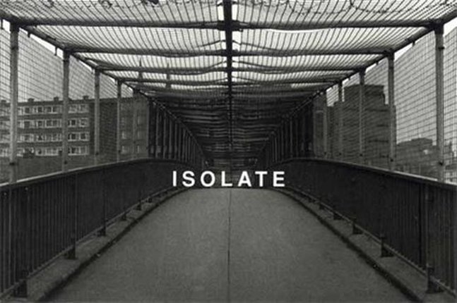
I chose to reearch Willie Doherty for my project as it not only relates back to my personal project in terms of the emotions that he conveys in his pieces but he also represents parts of the built environment around us that people would usually view as dirty, grimy and not a place that they want to be in a much more elegant and beautiful way. For example: the image above shows a bridge that has wire netting around the entire walkway, leading onto a council flat estate. This is not a place that people would go to out of choice because it is stereotyped as a "scary" place where gang fights and muggings happen on a day to day basis. But through the use of editing and overlaying a simple word onto the screen it instantly transforms into a much more desirable place due to the appearance and the emotions that are conveyed through the piece.
I particularly like this image as I feel it portrays many of the elements that I want to try and re-create within my project and develop these ideas that Willie conveys so easily into my own images. The composition of this image is flawless: the persective of the bridge is dead center to the image and the point where the hand rails vanish is in perfect alignment with not only the word that has been overlayed bu also with the 'Rule of Thirds'. As you can see, the word and the "horizon" of the bridge meet in the 'golden rectangle' which is where the viewer's eye is naturally drawn to straight away: this means that the simple yet very effective word that Doherty has used sets up the emotions and the atmosphere that the viewer feels almost instantly, allowing them to relate to the image and to relate these emotions to the scene that the image is set in.
I particularly like this image as I feel it portrays many of the elements that I want to try and re-create within my project and develop these ideas that Willie conveys so easily into my own images. The composition of this image is flawless: the persective of the bridge is dead center to the image and the point where the hand rails vanish is in perfect alignment with not only the word that has been overlayed bu also with the 'Rule of Thirds'. As you can see, the word and the "horizon" of the bridge meet in the 'golden rectangle' which is where the viewer's eye is naturally drawn to straight away: this means that the simple yet very effective word that Doherty has used sets up the emotions and the atmosphere that the viewer feels almost instantly, allowing them to relate to the image and to relate these emotions to the scene that the image is set in.
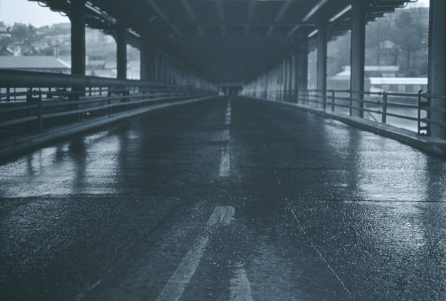
This image is very similar in terms of the layout of the photograph but he hasn't used an overlayed word to represent the emotions that he was trying to convey like he did in the image above, however, Doherty has still managed to create a large impact on the viewer through the composition and framing of the shot as well as the dark tones and lack of colour that he has created through editing the image. I like how this image appears to be finished in blue hues as it gives off an array of emotions just through this subtle use of colour: usually the colour blue represents the cooler emotions as it is a very cold colour in itself. This means that the viewer will instantly anticipate that the atmosphere of this image will consist of darker and lonely emotions, just like in the image above but this is very cleverly done without the use of a word to accentuate this.
The composition, framing and perspective is also extremely similar in this image to the other images that Doherty takes on a regular basis; he tries to create the same look to most of the images that he takes to keep a theme running through the bulk of his work. I think that this is a good trait to have as it means that you are costantly developing an idea rather then constantly changing it to take a completely different looking image which is what I want to do within my project to show my development from one intial idea through to my final piece.
The composition, framing and perspective is also extremely similar in this image to the other images that Doherty takes on a regular basis; he tries to create the same look to most of the images that he takes to keep a theme running through the bulk of his work. I think that this is a good trait to have as it means that you are costantly developing an idea rather then constantly changing it to take a completely different looking image which is what I want to do within my project to show my development from one intial idea through to my final piece.
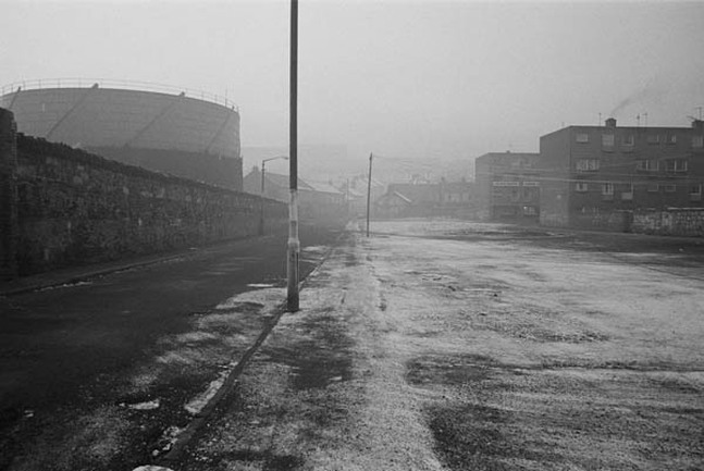
The image is completely different from the other images that I have looked at from Willie's work: he has edited this image into black and white to convey the lonely and darker emotions that are usually associated with being isolated in an empty street without any sign of other people. The addition of the frost on the road and the grey, foggy sky means that the small pathway that is visible looks even more enclosed and claustrophobic then before. I like this effect as it sets up the atmosphere for the viewer instantly, allowing them to then look at the detail of the built environment and to build up the image of being alone in this place.
The overall effect that this image gives is one that I want to try and replicate: the foggy sky creates that encapsulated atmosphere that is a very scary thing to comprehend, to be trapped in a place where you cannot see futher then 10 feet infront of you and to see no way out. If I can find a foggy day and take some images in the same style as Doherty does then I could create the same atmosphere that you can see here through the editing: I could also incorporate techniques that he uses such as the perspective of the road and placing an overlayed word in the center of the image to accentuate the emotions further to the viewer and to develop my style in the same way as Willie.
The overall effect that this image gives is one that I want to try and replicate: the foggy sky creates that encapsulated atmosphere that is a very scary thing to comprehend, to be trapped in a place where you cannot see futher then 10 feet infront of you and to see no way out. If I can find a foggy day and take some images in the same style as Doherty does then I could create the same atmosphere that you can see here through the editing: I could also incorporate techniques that he uses such as the perspective of the road and placing an overlayed word in the center of the image to accentuate the emotions further to the viewer and to develop my style in the same way as Willie.
