PHOTO SHOOT ONE - CLOSE - UP:
In this part of my project I wanted to experiment with looking at buildings close-up and to look at normal houses in an interesting and different way: I wanted to create some abstract pictures by using ordinary building materials such as bricks and fence and use some interesting editing techniques to pick out different colours and textures that you might not normally see at first glance and then upload the edited images as my first experimentation for this project. The following pictures create my contact strip for this photo shoot:
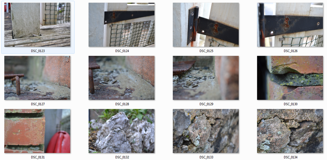
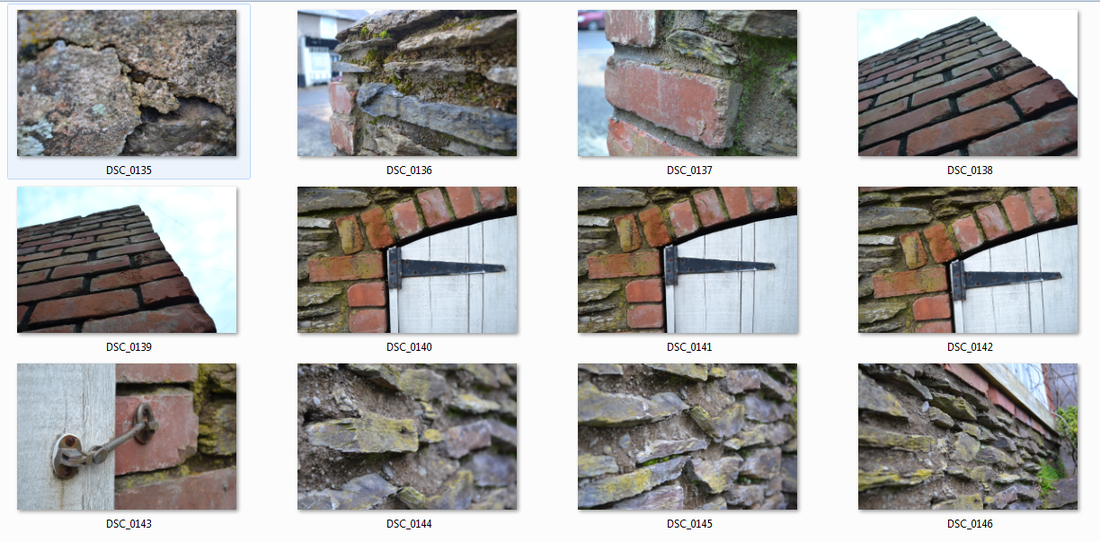
PHOTO ONE:
Step One
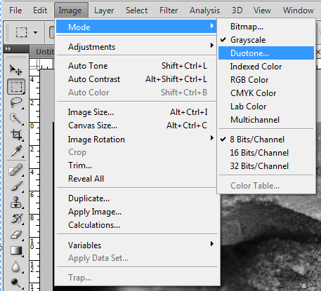
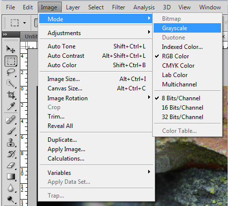
The first step I took in editing my photograph was to unlock the background layer of the image. I wanted to create a duotone image so that I could allow some colour to come through from a black and white image to add an extra layer of depth and an interesting atmosphere. To start this process I had to go into Image then Mode and select the option that turns the image into Grayscale. This then allowed me to start turning my image into a duotone.
Step Three
|
Step Two
Step Four
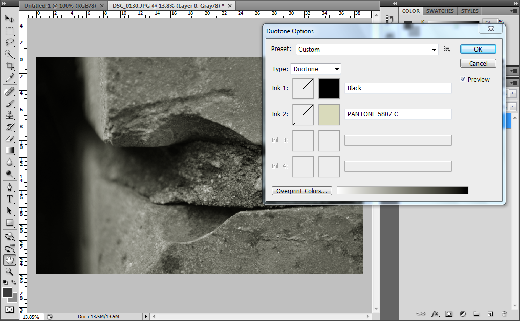
The next steps to editing my image was to go back onto Image then Mode and to select the option called Duotone. This then took me to the small window that is shown above and gave me the option to choose another colour to go alongside black to create the duotone. I thought that a light shade of green would compliment this picture really well, allowing the duotone to bring out the shadows and highlights from within the image.
|
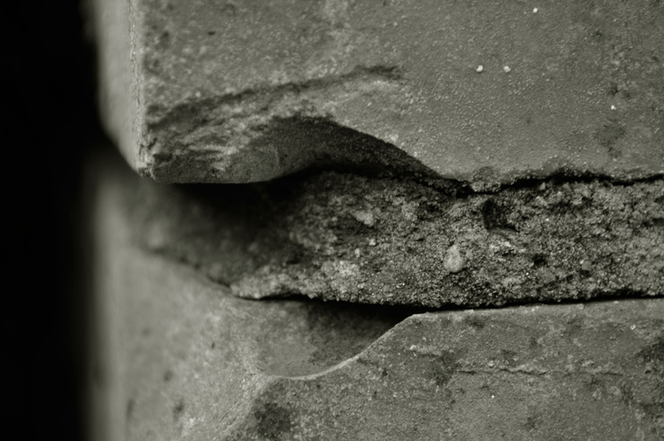
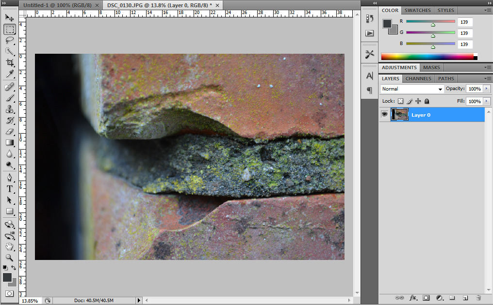
This is the finished image after I had finished editing it. I chose to take the picture close up to a set of worn and beaten bricks to show off the varied textures within the building materials. I think the experimentation was very effective as you can see all of the cracks and dips within the brick and the small blemishes that you wouldn't normally see at first glance. This is something that I wanted to acheive as this experimentation was to look at simple things that you see everyday and to turn it into an abstract and interesting phototgraph: allowing the viewer to see more detail then they would have seen before.
I like the effect that the duotone has given to this image: it has added more depth to the back of the photograph on the left hand side and has accentuated the blur of the image and added a shadow to compliment the shape of the brick. I have concentrated the focus of the camera towards the centre of the image, allowing the viewer to focus the on chink of brick that has been chipped out and the small stones and fragments within the cement that is holding the wall together. This is a different side to 'The Built Environment' that not many people would have seen before as the concentrated detail on the brick is just a small part of the building that draws peoples attention as a whole: I wanted to explore this side of my project as a photo shoot looking at these things close up, just like I have in the following images.
I like the effect that the duotone has given to this image: it has added more depth to the back of the photograph on the left hand side and has accentuated the blur of the image and added a shadow to compliment the shape of the brick. I have concentrated the focus of the camera towards the centre of the image, allowing the viewer to focus the on chink of brick that has been chipped out and the small stones and fragments within the cement that is holding the wall together. This is a different side to 'The Built Environment' that not many people would have seen before as the concentrated detail on the brick is just a small part of the building that draws peoples attention as a whole: I wanted to explore this side of my project as a photo shoot looking at these things close up, just like I have in the following images.
PHOTO TWO:
Step One
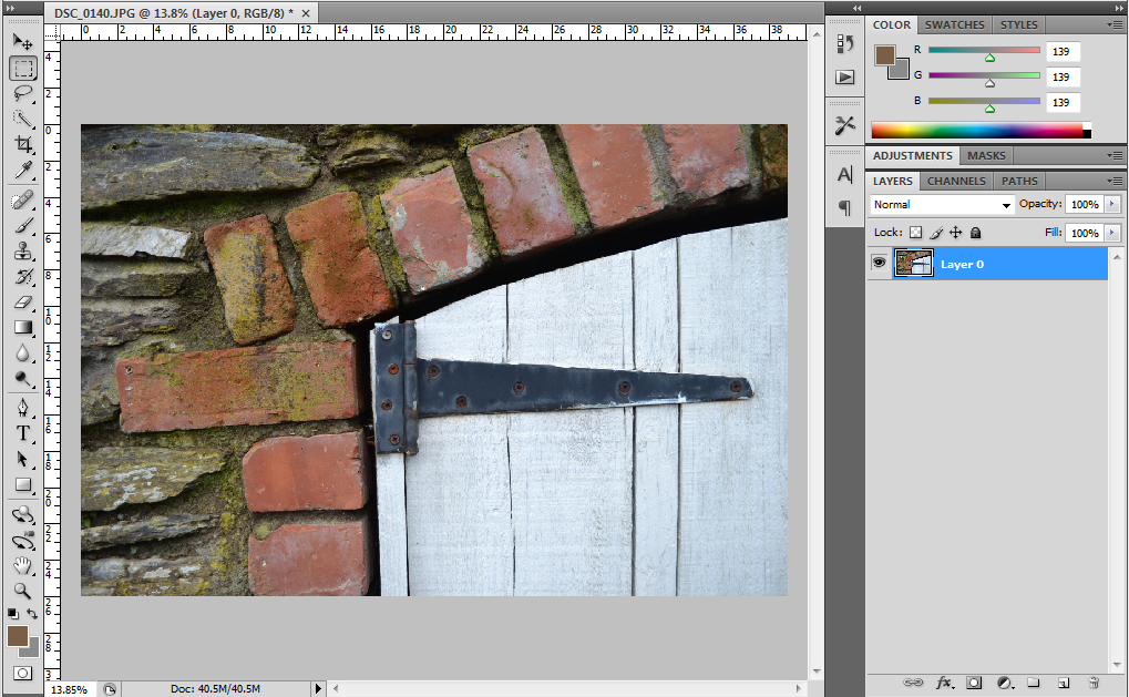
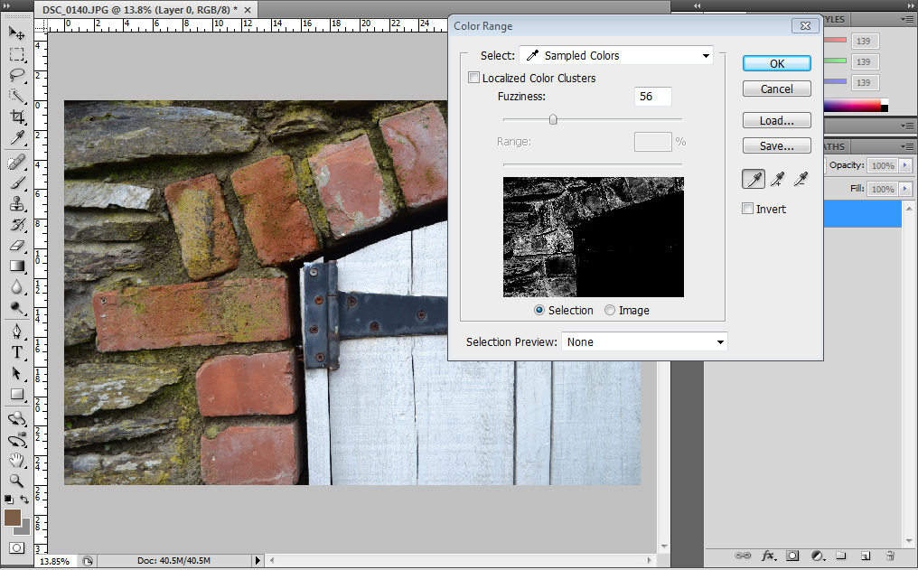
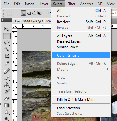
The first step I did when editing this photograph was to unlock the background layer so that I could manipulate it. I then wanted to select a specific colour from within the picture to make it more vibrant and to stand out more so I went to Select then Colour Range. This would allow me to click on any colour from within my image and it would highlight those areas with dotted lines to signify that they were selected, allowing me to change specific elements from within this area.
Step Three
|
Step Two
Step Four
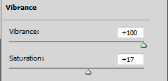
This then bought up the small window in the image to the left. This allowed me to select a specific colour from within my image: I could then change the Fuzziness which controls the amount of colour the tool selects and limits the spread of the areas it will highlight. You can see that I have selected all of the red and brown tones from within my image and I went on to put the vibrancy of these colours up to +100 and I also turned the saturation up to +17 to allow the colours from the archway to stand out much more then they did in the original image.
|
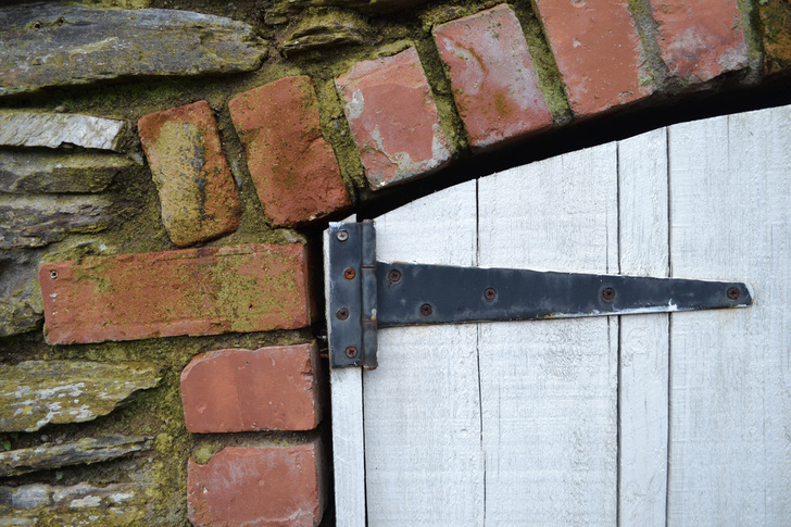
The editing of this image has allowed me to pick out the red and brown hues from within the image and this makes the bricks stand out from the painted white door in the arch: bringing out the green hues from the natural moss that is growing in and around the bricks. I think this is very effective as it brings forward all of the beautiful colours that naturally occur in everyday objects but draws the viewers attention to it from the heightened vibrancy.
The composition of this image is very simple: the door is in the right hand side of the frame and the attention to the brick work is in the left hand side of the frame. If you analyse this image according to the Rule of Thirds you will see that the hinges of the door have been placed in the center of the frame, acting as the initial center of focus. This also acts as a leading line towards the door which is a stark white colour in contrast to the natural reds and greens of the bricks, allowing the viewer to see the difference between the two types of structure. I think that this structure is very simple yet effective as the outcome shows a contrast of 'The Built Environment' between natural building materials and more processed, man-made materials that is seen everyday. However, the close up image and the vibrancy of the colours allows the viewer to see this in more detail and in a different way then they normally view this, allowing me to experiment with different ways of showing this contrast.
The composition of this image is very simple: the door is in the right hand side of the frame and the attention to the brick work is in the left hand side of the frame. If you analyse this image according to the Rule of Thirds you will see that the hinges of the door have been placed in the center of the frame, acting as the initial center of focus. This also acts as a leading line towards the door which is a stark white colour in contrast to the natural reds and greens of the bricks, allowing the viewer to see the difference between the two types of structure. I think that this structure is very simple yet effective as the outcome shows a contrast of 'The Built Environment' between natural building materials and more processed, man-made materials that is seen everyday. However, the close up image and the vibrancy of the colours allows the viewer to see this in more detail and in a different way then they normally view this, allowing me to experiment with different ways of showing this contrast.
PHOTO THREE:
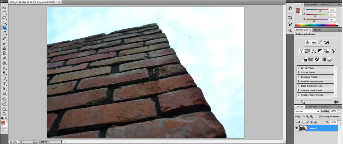
Step One
The first step I took when editing this image was to unlock the background layer to allow me to add more layers as I edited the photograph. I then added a layer of Levels which allowed to me change the levels of shadows, mid-tones and highlights within the image. As you can see this means that the shadows between each brick became slightly darker and the faces of the bricks became lighter so the viewer could see the colours within them clearer then before.
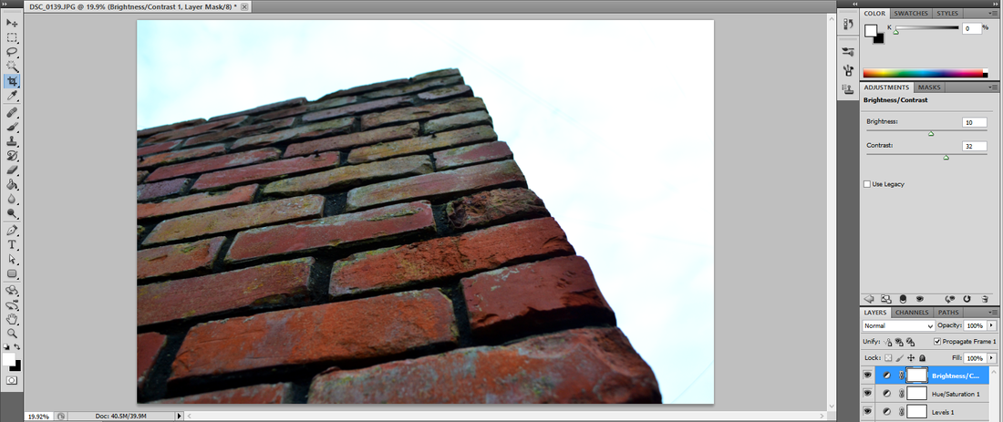
Step Four
|

Step Two
Step Three
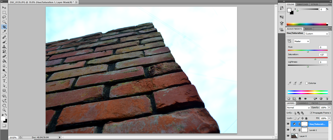
The next step I took when editing this photograph was to add a Hue and Saturation layer to allow me to enhance the colours of the bricks even further. I did this by turning the Saturation bar up to +37, this made the greener and redder hues from within the bricks stand out even more. I then added a Brightness and Contrast layer to the image: I turned the Brightness up to 10 and the Contrast up to 32 which allowed me to wash out the sky even further, enhance the colour of the bricks even more and make each brick stand out from the other.
|
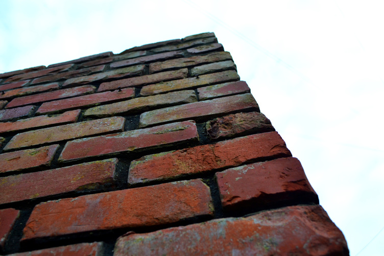
This is the final image after I had finished editing it. I tried to create an abstract photograph by looking at a simple brick wall from a very low angle that people would not usually look at things from. This meant that I was able to show a very simple and everyday object in an artistic and abstract way, accentuated by the way I edited the image. I think that the patterns that were formed by looking at the wall from this angle are very interesting: the lines that lead horizontally and vertically are set at regular intervals and create natural patterns within the photograph that are accentuated by the diagonal lines that create the perspective of the image.
The different colours that have been bought out from each of the bricks are ones that you wouldn't usually see at first glance because of the way I have edited the image. The yellow, green, orange and pink hues that have been bought through by turning up the saturation of the image are simple but very effective in giving the viewer another way to look at an ordinary brick wall and to build up the abstract way of looking at simple objects. I think that this perspective works really well with this image, accentuating the shape, size and colour of the bricks and the small yet very distinguishable differences between each brick, making each one very unique yet beautiful.
The different colours that have been bought out from each of the bricks are ones that you wouldn't usually see at first glance because of the way I have edited the image. The yellow, green, orange and pink hues that have been bought through by turning up the saturation of the image are simple but very effective in giving the viewer another way to look at an ordinary brick wall and to build up the abstract way of looking at simple objects. I think that this perspective works really well with this image, accentuating the shape, size and colour of the bricks and the small yet very distinguishable differences between each brick, making each one very unique yet beautiful.
I like this technique of taking images of the buildings close up as it allows me to look at these ordinary things that people see everyday and turn it into an abstract and interesting image. I plan to use this close up technique again within my project, allowing me to make patterns out of buildings, looking at the recurring and repetitive lines and formations within the buldings in the form of brick lines, wood lines and the rivets and joins in metal. I think that this will make some very interesting and unusual outcomes, with the help of some alternative methods of editing to compliment this.
