PHOTO SHOOT TWO - INSPIRED BY WILLIE DOHERTY:
After researching the work of Willie Doherty I decided to use the same techniques that he used in my own images: I wanted to take a series of images that were in the same kind of perspective as Doherty's work with the foggy and isolated atmosphere to accentuate the words I chose to overlay onto the images. There was an incredibly foggy morning that I came across when I happened to have my camera so I took advantage of this and snapped some images that looked up the road, enabling me re-create the effect that Willie creates within his images. Below is a contact sheet showing all of the images that I took:
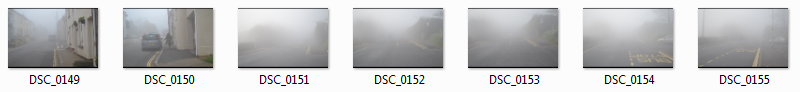
I think that the first image I took was the best image to use for the theme that I wanted to re-create. The second image is not foggy enough as you can see more detail in the cars ahead in the road and there is a person in the shot which is something that I wanted to avoid. DSC_0151 to DSC_0155 are too foggy and there is not enough detail in the background for the viewer to look at so I think that this would not reflect the emotions I wanted to convey within these images. This is why I chose to edit the first image I took multiple times to put different effects onto them and to add different words in order to slightly change the emotions reflected each time, as Willie Doherty does in his images.
PHOTO ONE:
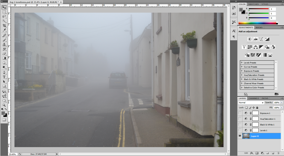
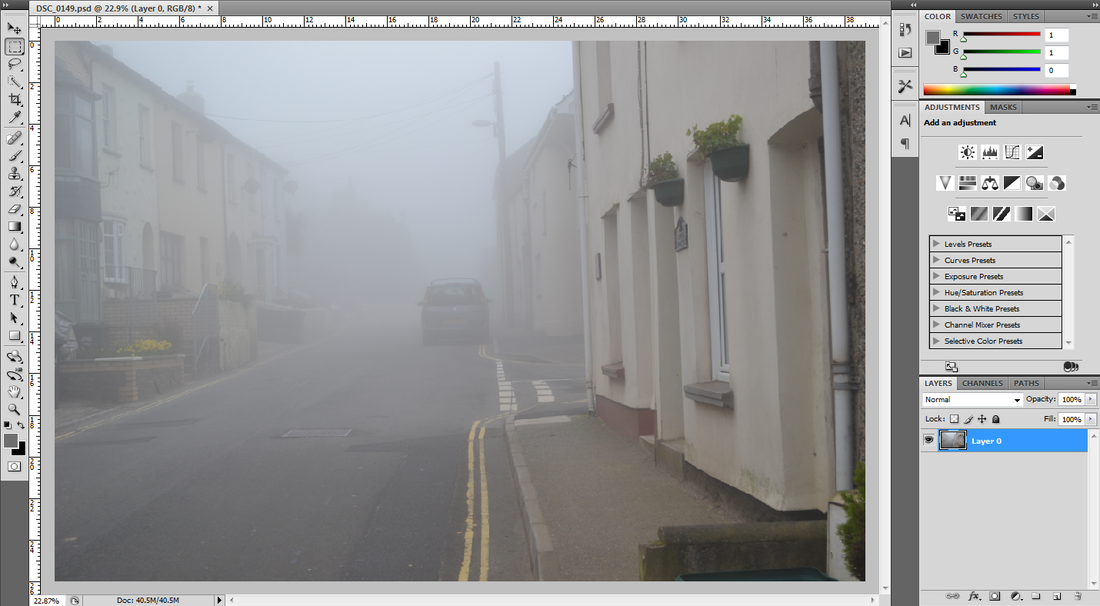
The first step I took in editing this photograph was to unlock the first layer so that I could make changes to it. This would then allow me to rub out certain parts of the image that I needed to work on and to change the colours around.

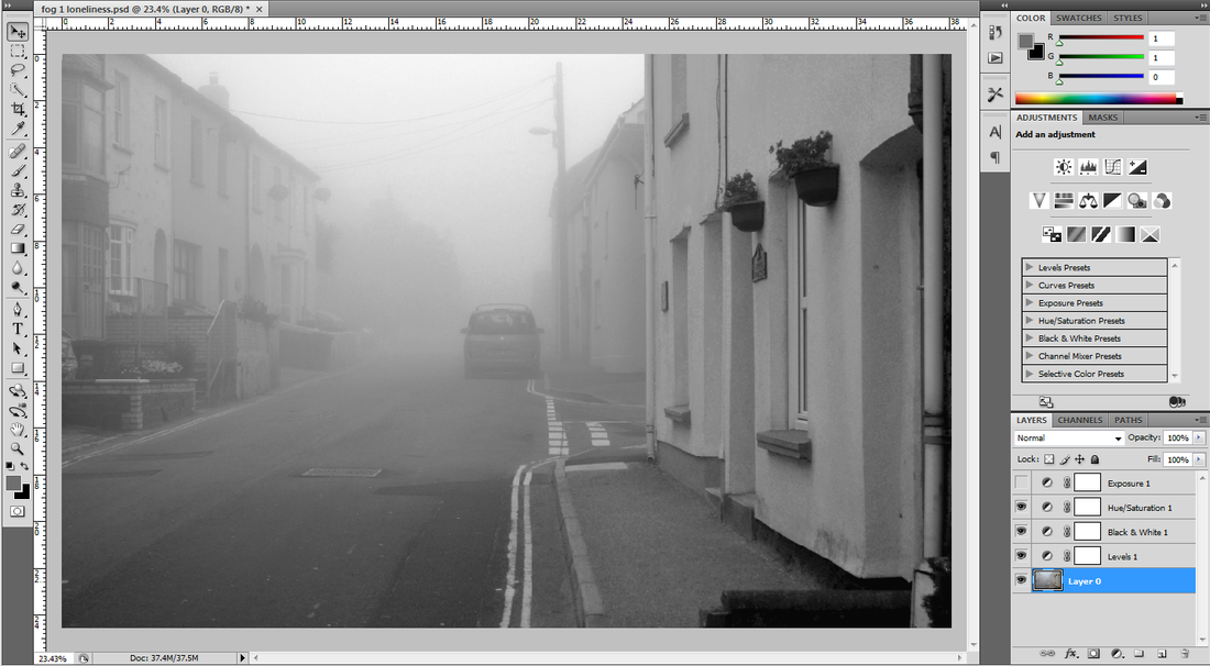
I then changed the image to black and white: this was an effect that I wanted to go for as I thought that it conveyed the lonely and sad emotions that I wnated to create within the piece.


I then used the text tool to put the word 'loneliness' onto my image. I chose this word because it reflected the emotions that I wanted to convey within the image effectively: this is one of the elements of Doherty's work that I wanted to incorporate into my won work. I used the font 'Leelawadee' in size 130 pt as I htought this font matched my style the best and put a full stop in between each letter so that I was happy with the letter spacing. Typogrpahy is a very important element to me so making this decision took a lot longer then I thought and I had to play around with the size and colour until it was right, which was hard to do and get right.
|
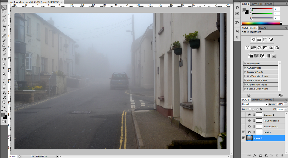
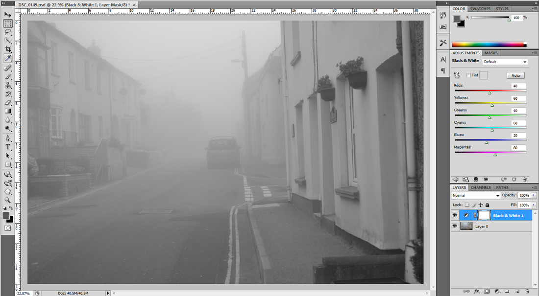
I then altered the contrast to make the road in the image darker and to make it stand out more against the foggy background. I needed to do this to add more depth to my images as the intial images I took was just varying shades of grey.
The step I took from here was to alter the birightness of my image so that the sky became a lighter shade and glowed brighter then it did before. I wanted this element to make the fog stand out more against the sky and to make the road and the street look darker and gloomier.

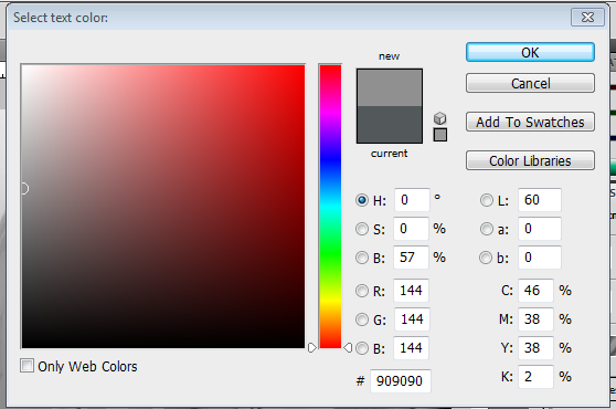
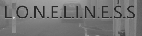
The next step to editing this image was to disguise the full stops that are in between the letter. To do this I had to highlight each one individually and use the colour select tool to match each indivual full stop to the exact colour of the background. This was a very hard process and was extrmely hard to get exactly right ut when I did achieve the outcome that I wanted I was very pleased with the results.
|

This was the final outcome of the text after I had finsihed perfecting the print size, the amount of space between each letter and disguing the full stops with colouring each one indivually to the same colour as the background. I am extremely pleased with the results of this and I aim to use the same editing technique on each of my images that I do in the style of Willie Doherty to ensure that I have used thew right typography to compliment the image.
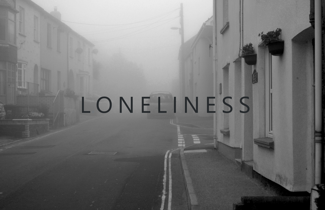
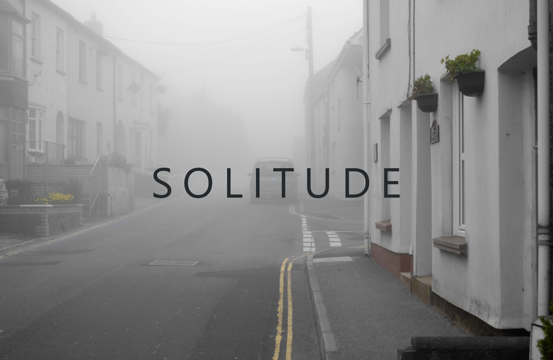
I am very pleased with the overall edit of this photo: the techniques that I took from Doherty's work were well incorporated into my work and I feel that I have created an image that mocks the style of his own photographs but that have my own added touch to create a finished photograph that I am very happy with. The composition of the image is an intentional persepctive photograph of a road in Combe Martin on a foggy day, the perspective of looking down a road from the near centre and either allowing it to reach a point in the far distance or to be cut off by something is the style in which Doherty takes his images. I have incorporated this element into my own work and have produced this image where I positioned the lines of the road from the centre of the image: these now act as leading lines for the viewers eye to naturally follow up the image towards the word that is placed in the centre of the image.
I think that the positioning of the word is very effective as it instantly draws the viewers attention to it and immeidatly sets the atmosphere of the photograph: I feel that loneliness reflects the emotions and the mood that the image conveys to the audience as the fog cuts off the road which gives the impressions that there is nothing else past the car and the lines of houses on either side of the image suggest that there is no way out of the street. With the lack of people in the photograph and an unmoving car that seems as if it has been forgotten, I think that 'loneliness' is a very suitable word for this image.
I decided to edit the picture in black and white as I felt that it conveyed the atmosphere better also: taking some of the inspiration from my last project titled 'Isolation'.
PHOTO TWO:
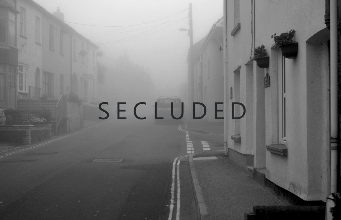
PHOTO THREE:

|
|